EnableAll logo
Back to Blog

7 signs your store needs an accessibility audit

Accessibility

04 Sep 202610 minutes

Share

7 signs your store needs an accessibility audit

Accessibility

04 Sep 202610 minutes

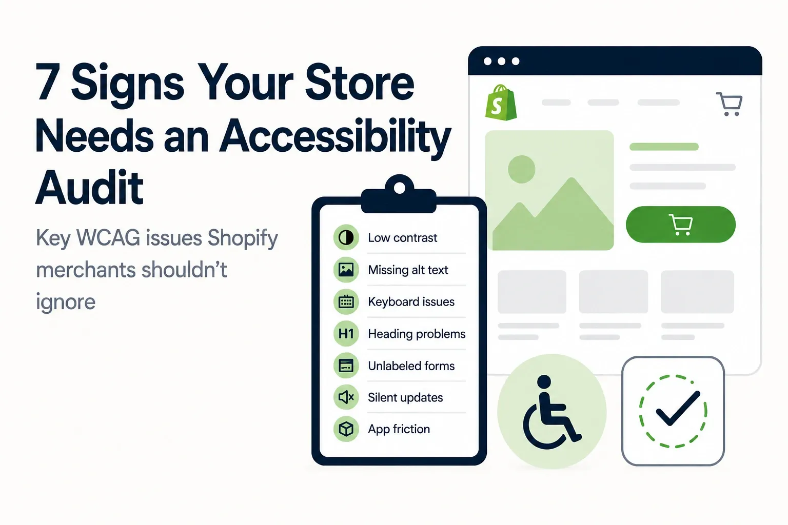
Illustration of a Shopify storefront with a checklist highlighting seven common accessibility issues, including low contrast, missing alt text, and keyboard problems

Many Shopify stores do not realize they have accessibility problems until a customer cannot complete checkout, a legal complaint arrives, or a redesign introduces new barriers. A Shopify accessibility audit is usually justified well before that point, especially when common WCAG failure points are already visible in the theme, apps, and product content.

TL;DR: Summary

  • A Shopify accessibility audit is most justified when the store shows known WCAG and ADA risk signals, especially low contrast, missing alternative text, weak keyboard navigation, poor heading structure, unlabeled forms, or dynamic UI that does not announce changes.
  • Shopify’s own accessibility guidance and W3C WCAG 2.2 point to the same core checks: body and button text should meet a 4.5:1 contrast ratio, large text should meet 3:1, images need accurate alt text , and keyboard users need a visible focus indicator with no keyboard trap.
  • Automated testing helps find repeatable issues fast, but WCAG 2.2 is designed to be checked with both automated testing and human evaluation, so a real Shopify accessibility audit should include both.
  • If a store relies on overlays alone, key code-level barriers can remain in forms, filters, drawers, popups, and checkout-related interactions. That is why remediation quality matters as much as scan results.
  • Accessibility work pays off beyond compliance. It supports conversions, SEO, and trust when product pages, navigation, search, and checkout become easier to use for more shoppers.

The real question is whether the store is already showing the signs that make an audit urgent, not whether accessibility matters in the abstract. For Shopify merchants, those signs tend to appear in the same places over and over: theme settings, image content, apps, forms, and JavaScript-driven shopping flows.

Why would a Shopify store need an accessibility audit now?

Shopify and W3C point merchants to the same audit targets: contrast, keyboard access, headings, images, and forms. When those basics fail, an accessibility audit is a current business need.

A Shopify store changes constantly. New apps add popups, product badges, cart drawers, review widgets, search filters, and subscription flows. Each change can affect how screen readers announce content, how focus moves for keyboard users, and whether buttons and inputs are still usable. If a team is shipping weekly updates, accessibility drift is normal unless it is being checked.

A common misconception is that a good-looking theme is usually an accessible theme. In practice, visually polished stores still fail on contrast ratios, missing labels, and broken focus order. That is exactly why an audit is useful: it checks the customer experience against testable standards instead of design intent.

Graphic showing five common Shopify accessibility issues: low-contrast text, missing alt text, broken keyboard access, incorrect heading order, and unlabeled forms.

“EnableAll is built specifically for Shopify stores and installs in minutes with no coding required.”

Which WCAG and ADA issues usually trigger a Shopify accessibility audit?

The main triggers are explicit and well documented. Shopify, WCAG 2.2, and ADA guidance all point toward contrast, alternative text, keyboard support, headings, and form labeling as£ high-priority audit targets.

Shopify says body text and button text should have at least a 4.5:1 contrast ratio against the background, while headings and other large text should have at least 3:1. That means pale gray copy, low-contrast sale badges, and text over busy hero images can all trigger audit findings quickly.

Keyboard support is another major trigger. WCAG includes a no-keyboard-trap requirement: if focus moves into a modal, menu, or filter panel, a keyboard user must also be able to move away from it. If a shopper can open a cart drawer with Tab but cannot reach the close control, that is a serious barrier.

Form labeling is often underestimated. Search bars, email capture forms, size selectors, shipping calculators, and checkout-adjacent widgets need labels that assistive tech can read. Placeholder text alone is not a reliable label. If labels disappear, error messages are vague, or required fields are not announced clearly, an audit is warranted.

What are the 7 signs your Shopify store needs an accessibility audit?

These seven signs are the most common and the most actionable. Shopify merchants usually see them in Dawn-based themes, custom themes, and app-heavy storefronts alike.

After a short manual review, these warning signs tend to stand out:

  1. Text contrast fails basic thresholds: Body text or button text looks faint, or large headings sit below the 3:1 standard.
  2. Product and collection images lack accurate alternative text: Screen reader users get no useful description, or they hear file names and repeated template text.
  3. Keyboard navigation breaks in menus, filters, or cart drawers: Focus disappears, skips controls, or gets trapped in a modal.
  4. Heading structure is inconsistent: Pages jump from H1 to H4, repeat multiple H1s, or use headings only for styling.
  5. Forms are missing real labels or clear error handling: Search, newsletter, account, and product option fields are hard to interpret with assistive tech.
  6. Dynamic UI changes are silent: Ajax cart updates, stock alerts, variant changes, and filter results change visually but are not announced to screen readers.
  7. New apps keep adding friction: Reviews, chat, subscriptions, and loyalty widgets often introduce inaccessible buttons, overlays, or focus issues.

If two or more of these signs are present, the case for a formal Shopify accessibility audit is strong. If checkout-related interactions are affected, the priority rises because the issue is revenue-facing, not theoretical.

How can a merchant run a quick keyboard navigation test on Shopify?

A fast keyboard test can reveal major barriers in under 15 minutes. On Shopify and Chrome, the most useful first check is still the simplest one: put the mouse aside and try to shop.

Step 1 is to start on the home page and press Tab through the main navigation, search, promotional banners, product cards, and footer. The tester should always see a visible keyboard focus indicator. If the outline disappears, blends into the background, or jumps unpredictably, the store likely needs audit attention.

Step 2 is to test the high-risk paths. Open the menu, search overlay, collection filters, quick-add controls, size pickers, cart drawer, and any popup. Then try to close each element with keyboard only. Pro tip: test both opening and escaping. Many stores let a keyboard user enter a popup but not exit cleanly.

Step 3 is to complete a task end to end. Add a product to cart, update quantity, apply a discount if relevant, and begin checkout. If focus gets trapped, lands behind a modal, or skips critical controls, that points to a code-level issue rather than a content issue.

How should a team check alt text, headings, and form labels?

This review should be systematic. Product pages, collection pages, and customer account flows usually surface the biggest content-level accessibility gaps first.

Step 1 is to inspect images by purpose, not by volume. Product photos, lifestyle images, icons, banners, and logos do not all need the same treatment. If an image conveys information, it needs accurate alternative text. If it is decorative, it should not create noise for screen readers. A common mistake is stuffing alt text with SEO keywords instead of describing the image’s function.

Step 2 is to scan heading structure on templates. Each page should have a sensible content outline, with one main H1 and supporting headings in order. Headings help screen reader users jump through content quickly. If the visual design uses headings only to make text larger, the document structure may be misleading even if the page looks fine.

Step 3 is to review forms with assistive logic in mind. Each field needs a programmatic label, required states should be clear, and errors should tell users what to fix. A vague error like “invalid entry” is an accessibility failure, not just a usability lapse.

“EnableAll combines code-level fixes with an accessibility assist-bar that includes 40+ WCAG AA and AAA features.”

Is an automated accessibility scan enough, or is human evaluation required?

Not by itself. WCAG 2.2 is meant to be tested with both automated testing and human evaluation. Automated scanners and manual review solve different parts of the same problem.

Automated testing is excellent for repeatable signals. It can catch missing alt attributes, empty buttons, color contrast failures, duplicate IDs, and some label issues at scale. That makes it useful for Shopify stores with hundreds or thousands of product pages.

Human evaluation is what finds context and behavior problems. A scanner may not understand whether alt text is accurate, whether heading order makes sense, or whether a filter panel is confusing once a screen reader starts reading it aloud. It may also miss workflow issues in dynamic components where focus movement and announcements matter.

Scans alone can report a clean score while still failing real users in search, cart, or product selection flows. Pairing scans with manual evaluation makes remediation more credible and more practical.

Is an accessibility audit better than an overlay for Shopify?

Usually, yes. A real Shopify accessibility audit identifies code-level barriers, while overlays mainly change the presentation layer or add user controls on top of existing issues.

That distinction matters because many common ecommerce failures live underneath the surface. A contrast control widget cannot reliably fix bad semantic HTML, broken labels, inaccessible app components, or focus management inside modals. An overlay can help some users personalize the page. It does not replace remediation.

This is where trade-offs matter. If a merchant needs a fast way to add personalization controls, an assistive toolbar can be useful. If the store also needs to meet WCAG expectations for forms, headings, keyboard behavior, and dynamic updates, code-level fixes still need to happen. Treating overlays as a full audit substitute is a common mistake.

“EnableAll says its Auto-Audit scanner identifies remaining accessibility gaps and provides code-level recommendations for remediation.”

What should happen after the audit finds issues?

The next step should be prioritization, remediation, and retesting. On Shopify, the order matters because not every issue has the same legal or commercial impact.

Step 1 is to rank findings by customer risk. Anything that blocks navigation, product selection, cart use, or key forms should move to the top. Contrast issues affecting checkout buttons deserve faster action than a low-priority decorative image problem on a blog page.

Step 2 is to separate theme issues from app issues and content issues. If a problem comes from the theme, a code fix may solve it across many templates. If it comes from an app, the merchant may need vendor input or replacement. If it comes from content, the team can often fix it through processes for alt text, headings, and banners.

Step 3 is to retest after remediation. If the team fixes a focus issue in the cart drawer, then keyboard and screen reader behavior should be checked again in the live flow. A pro tip here is to treat accessibility like QA, not like a one-time legal task. Regression is common when themes and apps change.

How often should a Shopify accessibility audit happen?

For most Shopify stores, an annual audit is a minimum and a release-based review is smarter. Fast-moving storefronts should treat accessibility checks as part of routine site governance.

A store that rarely changes may manage with scheduled audits plus periodic scanning. A store that adds seasonal landing pages, third-party apps, and ongoing UX tests needs more frequent checks. If there is a redesign, international rollout, or major navigation change, then a fresh audit is usually justified.

The same logic applies to legal coverage. ADA guidance points readers to technical standards like WCAG and Section 508, but compliance is not a single checkbox. If the site changes, the risk profile changes with it.

Can accessibility fixes improve conversion, SEO, and trust?

Yes. Accessibility fixes often improve usability signals that matter to both shoppers and search engines. Shopify stores like Trend Tonic are a clear reminder that accessibility work can connect to measurable commercial outcomes.

When headings are cleaner, alt text is more accurate, forms are easier to complete, and buttons are easier to see and reach, more shoppers can move through the buying process with less friction. Those same changes can support crawlability, clearer page structure, and lower abandonment in key flows.

The important trade-off is expectation setting. Treat accessibility as a usability investment that compounds over time, not a guaranteed instant lift in conversion. When the audit removes barriers from product discovery and checkout, it improves the same UX conditions that support trust and revenue.

“Trend Tonic saw a 46% increase in conversion after making ADA and EAA accessibility improvements.”

What should a Shopify team ask before choosing an accessibility audit partner?

The best audit partners can explain scope, method, and remediation clearly. For Shopify, the key question is whether the work will cover both automation and manual testing across real ecommerce flows.

A useful shortlist usually starts with a few practical checks:

  • Platform fit: Does the provider work specifically with Shopify themes, apps, cart drawers, and collection filters?
  • Testing method: Does the audit include automated testing and human evaluation against WCAG 2.2?
  • Remediation depth: Are findings translated into code-level recommendations, not only screenshots and generic warnings?
  • Ongoing process: Is there monitoring, retesting, documentation, or support for statements, VPAT needs, or legal follow-up where relevant?

If the provider cannot explain how it handles keyboard traps, focus indicators, form labels, and dynamic updates in ecommerce journeys, the audit may be too shallow. If it can show how findings map to real storefront behavior, the result is more likely to help both compliance and performance.

In just a few clicks.

EnableAll accessibility widget icon
Facegym logo
Unhidden logo
BuDaGirl logo
Sabatino logo
Trend Tonic logo
Antler logo