EnableAll logo
Back to Blog

Color contrast ecommerce accessibility: Boost sales

Accessibility

22 Jul 20268 mins

Share

Color contrast ecommerce accessibility: Boost sales

Accessibility

22 Jul 20268 mins

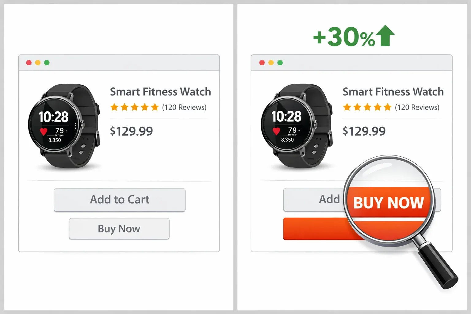
Comparison of low-contrast and high-contrast 'Buy Now' buttons, showing how colour and size improve visibility and sales.

Color is doing two jobs on an ecommerce site: it carries brand style, and it signals “this matters.” When color contrast ecommerce accessibility is weak, that signal gets fuzzy. People hesitate, miss the button, or abandon the page without realizing there even was a next step.

That is not only an accessibility issue. It is a conversion issue.

Roughly 8% of Western men and 0.5% of women have some form of color blindness, which means a meaningful chunk of shoppers will not perceive certain color differences the way a designer does (UserTesting). Add aging eyes, low-quality screens, bright sunlight, fatigue, and you start to see why “looks fine on my laptop” can quietly drain revenue.

Contrast is not about “red buttons,” it’s about separation

A lot of CTA talk gets reduced to folk wisdom: red beats green, orange beats blue, and so on. Real test results often show lifts after color changes, but the more useful pattern is simpler: the winning button is usually the one that separates more clearly from its surroundings.

CXL makes this point bluntly: there is no magic color; what matters is how much the button contrasts with the area around it (CXL). The same idea shows up across conversion case studies: the new choice stands out, and shoppers act faster because the interface is easier to scan.

That connection between accessibility and conversion is also practical, not philosophical. One accessibility expert put it this way: accessibility fixes usually make a site easier to use for everyone, and “easier to use” is another way of saying “more likely to convert” (Totally Digital).

The WCAG numbers that matter for ecommerce UI

WCAG defines contrast in measurable ratios, which is useful because it turns subjective debates into something teams can check in design files, QA, and production.

The common targets are straightforward: normal text against its background needs at least 4.5:1 contrast (WCAG 2.1 AA); large text, roughly 18pt regular or 14pt bold, needs at least 3:1 (WCAG 2.1 AA); and user interface components and graphical objects — like the boundary of a button against the page — need at least 3:1 under Success Criterion 1.4.11, Non-Text Contrast, which was introduced in WCAG 2.1 AA and carried forward unchanged into 2.2 (see guidance summaries like Make Things Accessible).

Two details trip up ecommerce teams. First, button contrast is really two checks, not one. The label text must meet text contrast against the button fill, and the button itself should be visually separable from the background. Second, product pages are rarely “flat.” Gradients, photography, promo badges, and price styling create busy backdrops that make borderline contrast fail in the real world.

What conversion tests teach us about accessible CTAs

Published A/B tests are not accessibility studies, but they do show how sensitive shoppers are to visual clarity. When a CTA becomes easier to notice and read, clicks move.

The clearest documented example is the often-cited HubSpot/Performable test: on a page where green was already the dominant color, switching a CTA button from green to red produced a 21% lift in clicks — not because red is inherently a “better” color, but because it broke from a green-on-green page and gained contrast it hadn’t had before. Analyses of that test consistently point to the same driver: contrast against the surrounding page, not the specific hue, is what moves the click.

Treat any single test result as directional, not universal. The same red button would not automatically win on a page that was already red-and-white. What tends to transfer across sites is the underlying principle — maximize separation from the surrounding palette — not any specific color choice, so it’s worth testing on your own pages rather than copying someone else’s winning color.

These wins also tend to bundle multiple improvements: contrast, size, whitespace, and predictability. A high-contrast button can still underperform if it is tiny, placed inconsistently, or crowded by equally loud elements.

CTA contrast: a practical design recipe (not a style argument)

Treat CTA contrast as a system, not a one-off tweak. On Shopify storefronts especially, small theme edits can ripple across product pages, cart, quick add, sticky bars, and dynamic checkout buttons.

A useful mental model is: “Can a rushed shopper spot the next step in one second?”

After you answer that, make it measurable. Check both text contrast and component contrast. Then test on mobile outdoors. Then simulate color vision deficiencies.

A few patterns work consistently across brands: use one primary CTA style site-wide, reserve the highest-contrast pairing for the highest-intent action such as Add to cart or Checkout, and keep secondary actions like wishlist, compare, or save-for-later visually quieter so they don’t compete for attention.

The same pitfalls show up repeatedly on ecommerce sites: pastel button fills paired with white text, ghost buttons placed on busy imagery, disabled states that look identical to enabled ones, and focus outlines that have been removed or made too subtle to see.

If you only fix one thing this week, fix the “white text on light brand color” situation by adjusting the foreground color to enhance contrast. It is everywhere, and it quietly blocks shoppers who are ready to buy.

Product imagery and contrast: where accessibility meets merchandising

Contrast is not just a button problem. In ecommerce, product imagery is part of the buying decision, and color contrast influences whether shoppers can perceive product shape, edges, texture, and key differentiators.

This shows up in a few recurring places: text laid over hero banners, sale badges, and “New” ribbons; variant swatches and thumbnails; product photos with low separation between the product and its background; and size charts, infographics, and “how it fits” graphics.

Brand teams sometimes worry that accessibility rules will flatten their look. In practice, the goal is not to remove style; it is to stop putting critical information in low-contrast conditions.

Bounteous’ mini case study on an orange button is a good reminder that perceived legibility and numeric contrast ratio are related, but not identical. Testing two text-color options on the same orange button, the black-text version had the higher measured ratio (6.44:1, comfortably AA-compliant) while the white-text version measured only 3.26:1, below the 4.5:1 text minimum. Yet when the team asked colorblind participants which version they preferred, 61% chose the lower-contrast white text (Bounteous).

The lesson isn’t “ignore the ratio” — it’s that a passing ratio is a floor, not a substitute for testing with real users, especially when a brand color limits your options.

Three image scenarios that commonly fail (and how to fix them fast)

The fastest wins usually come from removing text from complex photography, or giving the text a stable surface so contrast stays predictable.

Hero text sitting directly on a photo

Add a solid or semi-opaque scrim behind the text, or move the text off the photo.

Product-in-use photos with low edge separation

Keep these images, but make sure at least one gallery image is a clean “catalog shot” with clear edges and accurate color.

Promo badges placed over mixed backgrounds

Use a consistent badge container (solid fill) and confirm the badge text contrast passes.

Teams tend to choose from a short set of fixes: neutral backgrounds for at least one primary product image, consistent lighting and exposure guidelines, template-based overlays with pre-approved contrast-safe color pairs, and avoiding thin fonts inside image assets.

Don’t rely on color alone for variants, status, or meaning

Even with perfect contrast, color-only meaning still breaks for many shoppers. If “in stock” is green text and “out of stock” is red text, some users will not read that difference quickly, and screen reader users may miss the intent if the markup is not explicit.

The fixes are refreshingly straightforward: add color-name labels next to swatches, pair text with icon patterns like a checkmark, warning triangle, or slash, use explicit status text such as “In stock,” “Low stock,” or “Sold out,” and give selected states a pattern or border difference, not just a color change.

That approach also helps sighted users who are scanning fast, which is most shoppers most of the time.

Tooling that catches contrast problems before shoppers do

Contrast issues slip in because ecommerce sites change constantly: new campaigns, new bundles, theme tweaks, app widgets, updated PDP templates, all impacting color contrast ecommerce accessibility. So the best process is not “audit once,” it is “check continuously.”

A lightweight toolkit usually includes a color contrast checker for hex values (WebAIM is a common choice), a browser audit tool that flags contrast failures on real pages (axe, WAVE, Lighthouse), and a way to simulate vision differences during QA (Chrome DevTools can emulate vision deficiencies).

When you do these checks, aim at high-impact surfaces first: homepage hero, collection grid, product page CTA cluster, cart, checkout entry points, and any sticky ATC bars.

Where platforms like EnableAll fit in for Shopify stores

Many Shopify teams want accessibility improvements, but do not want long remediation projects that clog a developer backlog. That is where an ecommerce-focused accessibility platform can help, as long as it is doing real remediation rather than only masking issues.

EnableAll positions itself as the Code-Fix accessibility app for Shopify: an AI-powered platform that fixes key WCAG barriers directly in a store’s code and layers on a feature-rich Assist-Bar so shoppers can personalize how they browse and buy — including contrast and display preferences. Roughly 1 in 4 shoppers need some form of accessibility support (EnableAll), which is exactly the audience contrast fixes are for.

For contrast work specifically, that combination matters: if contrast is broken in theme code or injected widgets, it needs a code-level fix, and if shoppers need stronger contrast for their own needs, an Assist-Bar can offer user-controlled settings without forcing one experience on everyone.

If you are evaluating tools in this category, ask direct questions about how contrast problems are addressed across theme sections, third-party app components, and dynamic content, not only in a static audit report.

A simple evaluation checklist can sound like this: can it actually fix contrast in templates and UI components, not only add an overlay (code-level remediation)? Will it catch regressions when campaigns or theme edits ship (ongoing monitoring)? Does it handle product galleries, variant selectors, sticky add-to-cart, and mini-cart patterns (ecommerce coverage)? And does it keep pages fast while applying fixes (performance impact)?

A weekly contrast routine that fits real ecommerce operations

Teams move faster when the process is small enough to repeat.

Pick one high-revenue flow per week — collection to PDP to cart, or email landing page to checkout — and run the same quick pass: check primary and secondary CTAs for text color contrast and component contrast; check focus states for keyboard users, including visible outlines on buttons and links; scan image overlays and promo badges for predictable readability; validate variant selection states without relying on color alone; and re-check on mobile with brightness turned down and up.

When this becomes habit, contrast stops being a last-minute design debate and starts acting like what it really is on ecommerce sites: a quiet, measurable driver of sales and usability.

In just a few clicks.

EnableAll accessibility widget icon
Facegym logo
Unhidden logo
BuDaGirl logo
Sabatino logo
Trend Tonic logo
Antler logo